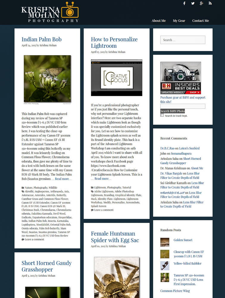
If you’re a regular reader of my blog, you’ve probably noticed things are looking a little bit different today. It’s not just you. Last night, I gave this blog a pretty drastic makeover. Don’t get confused as all of the content and photos is perfectly maintained. Nothing was disturbed while making the change (hopefully!). There are surely a couple of design and graphic changes, which I hope will make your browsing experience so much better.
A lot of planning and strategising went into the new design, so I thought I’d share how the current design came to be and why I made these changes. The last design change of this blog was in Aug 2008 when I adapted the darker design as I shifted my blog from technological blog to one used to describe photography and nature. The old design was dated—“long in the tooth,” as they used to say. It had also started becoming slower as I was constantly tinkered and added code to existing design with several hacks to make it work as I wanted. Many have complained slowing of my website when they were browsing.

Darker design of my earlier blog had its value enhancing the look of the photograph. But over time as the design trend changed to more flat design. I had to adapt to such a change and it was not easy to tweak existing design to get the newer look. Older design had lot of drop shadow panels, which started looking aged as the modern design language started seeping in. I wanted a clean and brighter look, while not changing user’s experience. The monitor sizes have also started becoming larger. So I started exploring for a new design which is more responsive and adapts to screen size. I have tested this design with large 4000 pixel width screen to as small as 320 pixel and the design seems to adapt fluidly. As more and more people started using smartphones and tablets from traditional PC’s touch and feel of the website needed a drastic makeover.

Next goal is to change my home page. It used to be one long scrolling page of recent 3 articles. Many new users did not bother to go beyond those first few pages as they used to get exhausted with such a lengthy post. Now it is changed to short 100 word excerpts of latest six articles. As he clicks more button at the bottom it extends continuously and then became a river of articles. On every page I am presenting the reader with random interesting posts and photos which they can explore. I wanted the whole experience more of fun driven experience than a tedious journey. Search functionality has been enhanced to give better results. New web based fonts are used to improve readability. Now images when expanded get their EXIF info as overlay on them which disappears once mouse is taken away from the photo.

Truth be told, older design of my blog’s mobile experience left something to be desired. Earlier blog design which originated somewhere in 2007 was not mobile friendly. Now around 30% traffic to my blog comes from mobiles now and surely I was disappointing that population. So I completely revamped the mobile version of our blog to make navigation, content discoverability, and social sharing much easier for our mobile and smartphone visitors.
Behind all these changes there were many of you who contributed their ideas and suggestion. My good friend and graphic wizard, Nitin Kumblekar is the genius behind the new improved Logo design. Afetr he designed my Creative Focus website Logo I asked him to create one for this and he was gracious enough to help me out. My two other great buddies, Roshan Rao and Ajith Kamath helped in refining the design as I did the coding of my little corner of the internet. I have used WordPress with GeneratePress Theme as it suited just fine for my purpose. The coding and refining took little over a month, followed by testing and finding any of the mismatch with older content. Hopefully now it is ready for your consumption.

To make your blogging experience much faster and enjoyable next month I will be shifting to larger and faster server which will be able to handle my very large set of audience. Traffic had exponentially grown. From over 1 GB bandwidth to a month now it consumes whopping 40 GB per month with nearly 20,000 hits a day. My existing server is not able to cope such a large request and sometime I see it buckling under pressure.
Thank you for patronizing and supporting my madness and coming back week after week. You can be sure to see at least one blog article every week without fail which I am maintaining consistently for last 5 years. You can follow me on Facebook, twitter, Flickr, 500px & Google plus as well as other social media. Hope you will enjoy and support my blog as you have done all these Nine long years and I would love to hear your opinion of the blog’s new look.


Hi,
Sir your madness has infected many patients like me.
It has definitely help in giving direction to our hobby.
Your new website is a lot user friendly.
Looking forward to your Blogs have been following them regularly.
Dear Dr Mateen Patel,
Thank you for getting my madness. I know you will enjoy the posts just a little better than earlier using the new design. My blog updates will not stop at all. Keep visiting.
The page is loading faster with cooler look and feel. It’s really good to surf 🙂
Wonderful Krishi. Superb job.