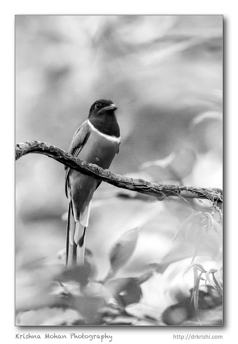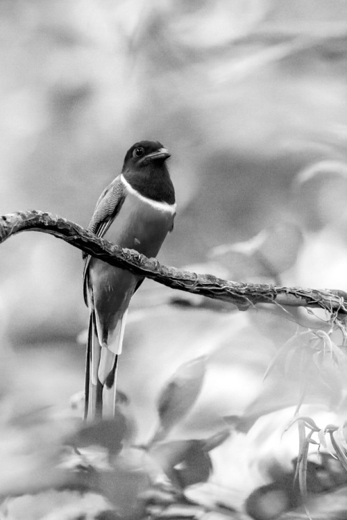
In my previous write up, we discussed Digital black & white Photography. Let us now consider the best techniques for converting a colour photograph to black & white.
In-camera digital black & white photography will often not yield the best example of black & white photo, which is why it’s advisable to shoot in RAW format, and get a colour image, which can then be processed to an optimal quality black & white photograph.
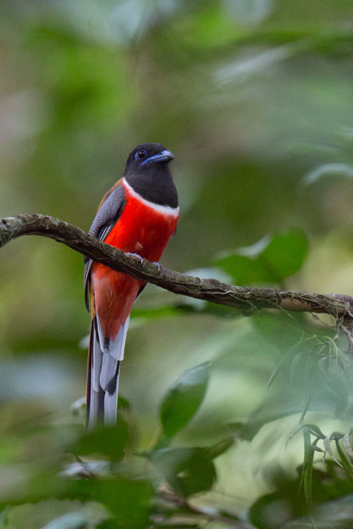
Ever wondered how professional photographers manage to bag those dreamy black and white or sepia toned photographs, while your images turn out dull and flat looking?
It is important to understand the fact that the camera sees light and colours differently than the human eye, for example, Black and white film sees blue tones in a much lighter than our eyes. Back in the hey days of film photography, coloured filters were utilized to shift how black & white film perceived and rendered a particular scene. For instance, using a red filter would lighten anything red in the image and darken blue tones. So if you were a landscape photographer you’d often use a red filter to darken the sky and make it less washed out. A green filter would lighten green and blue tones and darken red and orange. Thus, photographers used appropriate filters to capture the scene as they envisioned and deemed fit.
Since I prefer using ‘Adobe Photoshop Lightroom’ for my post processing needs, allow me to demonstrate how to use the tool to create better black & white images. In both Lightroom and ACR (Adobe Camera Raw) in Photoshop, you have the same tools at your disposal and thus without the utilization of filters, one can easily adjust how an image is rendered in black & white.
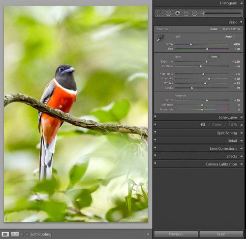
Before beginning the black & white conversion, it is imperative to first correct the colour and tone to bring the image to a “normal” starting point (and minimize exposure problems that would come into play, later).
With your image of choice open in Lightoom, proceed to ‘Develop module’, then opt for the White Balance tool. Click on an area of the image that you wish to be neutral, in tone. It’s best to choose something other than pure white: Try something that’s off-white or grey.
Next, adjust the sliders in the basic modules – Exposure, Contrast, Highlights, Shadows, Whites and Black sliders, so that the image looks appealing.
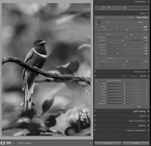
Using Lightroom, simply pressing the “V” key, will give you a quick black & white conversion. Think of this feature as a quick way of foreseeing past the colour to determine the black & white potential. Don’t expect this conversion to look amazing: Remember it’s just a starting point!
In Lightroom’s ‘Develop module’ (and ACR) there are a few ways that images can be converted to black & white. You can just pull the saturation slider all the way to left, to -100. One can also do something similar with the Vibrance slider, but it may not give you 100% black & white imagery, depending upon the image. While both these options will give you a black & white result, they would give you no control over how the colours render into various shades of grey. A better choice then, in my opinion, would be to use the black & white mix, located on the third panel down on the right in ‘Develop’ along with ‘HSL’.
There is an ‘Auto’ button, clicking which would allow Lightroom to apply a predetermined ‘black & white mix’ to an image. One can also set up Lightroom preferences in such a manner, so as to apply these settings whenever the ‘black & white mix’ option is selected, proceeding to further refine an image, from there, otherwise all sliders options will start at ‘0’. One could also, alternatively, try adjusting different colour channel sliders in the black & white mix module to try and achieve the result of choice.
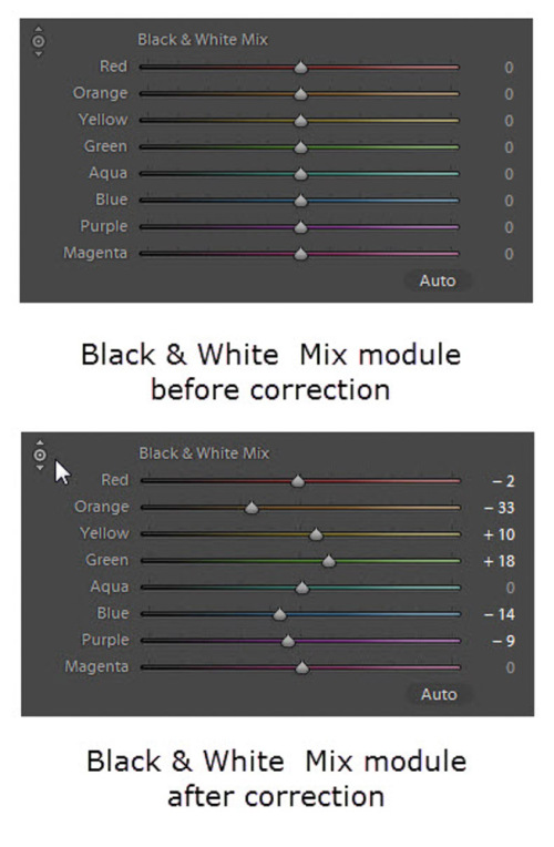
Another little known trick for using these sliders is the funny looking, little double circle thing on the top left. As you move your mouse pointer over it, you’ll see two arrows, one pointing up, the other downwards, and a prompt which says “Adjust black & white Mix by dragging in photo”.
This is the target adjustment tool.
What on earth does that mean, you may wonder?! If you click on the little circle, your mouse pointer will now have those little up and down arrow keys, as well as your cursor showing the same icon as you hover over an image. Click anywhere on the image, while holding and dragging will adjust ONLY the colours that you’ve clicked on. Drag up to move the sliders to the right (+) and drag down to move them to the left (-).
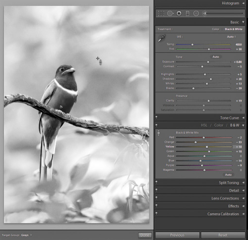
This is very helpful if you do not know which sliders to adjust. Just select the area of the image you’d like to adjust the tones on and drag away!
Sometimes even after using the black & white mix sliders, the resulting image can come across as flat and dull looking. Take it up a notch by adding some punch to your image, using these three techniques.
- Increase the clarity: if it’s a scenic I’ll push it quite far like +60 or higher, if it’s a person I keep it under +30 or they start to look a bit crunchy and overly wrinkled (especially if the photo is of your friend or your spouse, they tend not to be too happy about that)
- Lower the black slider, until it looks good. If you click and hold the Option/Alt button while sliding it, you will get to see exactly where your blacks are clipping (meaning going off the chart on the histogram and having no detail). You can use that information to make sure you have just enough blacks, but also make sure you keep all the detail in important areas.
- Increase the contrast by using either the Contrast slider or Curves.
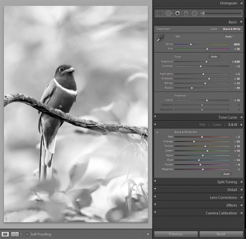
Occasionally, making these contrast adjustments will affect the overall image and you may want to go back and work on the black & white sliders a wee bit, as well. It’s a dance, play them back and forth until you get a mix you like.
Make sure you actually have some black, and some white in your image. Check the histogram to add contrast or increase the blacks, whites, or both, to get a full range of tones, in your photograph. No matter what the subject in the photograph is, possessing enough contrast to have pure white and pure black, is the key to achieving a stunningly beautiful, black & white imagery. Otherwise you would be merely left with a bunch of muddy, grey images.

